Who we are

Jenssen Design Associates (JDA) is a graphic design consultancy with over 30 years’ experience in delivering projects within branding and communications, wayfinding and signage systems, environmental graphics, and heritage and contemporary interpretive design. Our work is in use every day, across most sectors, and in businesses large and small; public and private.

Read more >

What we do

While our work is diverse, all projects share a common approach – to combine research, strategy, collaboration and innovation to deliver solutions that communicate with clarity, relevance and meaning.

Introducing the ‘care household’ modelWayfinding signage / branded environments
New identity celebrates a 170-year heritage of careBranding / sky signs / branded environments / commemorative
A sensory bushwalking experienceInterpretive design / sculpture / illustration / track and trail markers
Capturing ‘the look’ of flavourBranding / visual identity
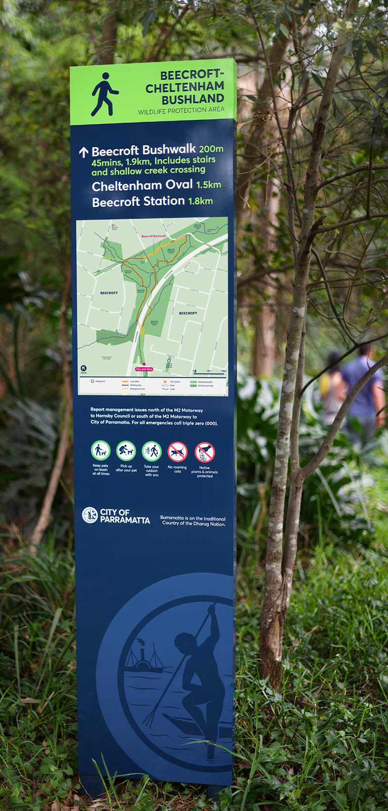
Leading the way in bushland wayfindingWayfinding / Interpretation / Environmental heritage

News

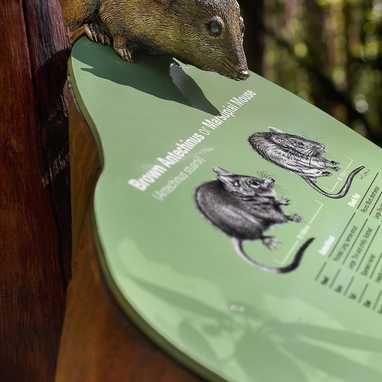
This bronze sculpture of an Antechinus — a native Australian marsupial — was created using the ‘lost-wax’ casting method. Lost-wax casting is an ancient technique in which a wax form is sculpted, encased in a silica mould, and then melted away to create a cavity. Molten bronze is poured into the cavity, where it hardens, leaving a metal version of the original form. This sculpture is part of a series of life-sized bronzes, mounted on interpretive signage that was also designed and illustrated wholly in-house by our resident artist. The project, which comprised 11 illustrations and 5 sculptures across 24 items of interpretive and wayfinding signage, was installed along an accessible bushland track at Galston in northwestern Sydney.
This bronze sculpture of an Antechinus — a native Australian marsupial — was created using the ‘lost-wax’ casting method. Los...Number of Likes 12 Number of Comments 0
A sample of the comprehensive interior wayfinding signage component of a broader interior and exterior signage commission for a retirement and assisted living village. Set amidst landscaped grounds and bordering native bushland, Green Hills, a @freshhopecommunities facility at East Maitland, includes 60 one- and two-bedroom villas, complemented by a Wellness Centre, Café, Respite Centre, and Community Kitchen.
A sample of the comprehensive interior wayfinding signage component of a broader interior and exterior signage commission for...Number of Likes 11 Number of Comments 0
A glimpse of the exterior, destination and wayfinding signage system we delivered for @freshhopecommunities, and its extension to parking areas. The design aesthetic was inspired by FHC’s vision to convey a ‘non-institutional’ environment. To achieve this, we referenced the facility’s contemporary architecture, interior design, and the surrounding natural environs. The resulting signage system features faux timber elements, and a colour palette in response to the building’s proximity to a riparian corridor and bushland park. Consideration was given to material durability and ease of maintenance, with the specification of aluminium cladding in a printed and textured woodgrain finish.
A glimpse of the exterior, destination and wayfinding signage system we delivered for @freshhopecommunities, and its extensio...Number of Likes 14 Number of Comments 0
A glimpse behind the scenes during installation of interpretive signage on Brooklyn Park Mangrove Boardwalk. Deployment considerations included a precise check measure of the existing boardwalk structure to ensure a perfect fit of the bespoke fabricated sign frames, and minimally invasive methods during installation so as to leave this sensitive environment as we found it. With careful preparation and an eye on the tide, these cantilevered panels and other freestanding elements, went in smoothly with the skill of Woodpecker Signs. Collectively, the signage integrates well with the design aesthetic of this popular walkway. It was hugely rewarding to receive immediate positive reaction from passers-by as the signs went in. A sincere thank you to local resident Venette F., who got in touch after the previous post about the project, with this generous feedback ...
A glimpse behind the scenes during installation of interpretive signage on Brooklyn Park Mangrove Boardwalk. Deployment consi...Number of Likes 7 Number of Comments 0
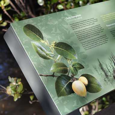
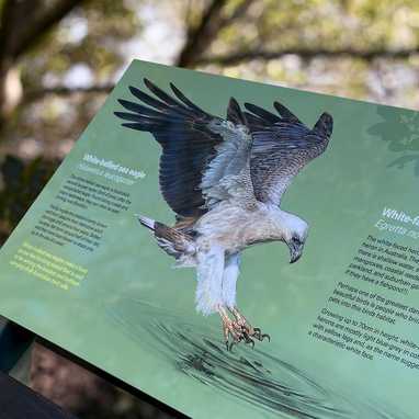
A series of interpretive signs, illustrated in-house and produced to help visitors to Brooklyn north of Sydney, understand the significance of mangroves and the biodiversity they support. Located on the Hawkesbury River estuary, the site is significant as it represents one of the densest regions of mangrove in Australia. Apart from being home to a huge variety of marine and birdlife, these shoreline forests perform the important role of protecting against erosion and extracting carbon from the atmosphere - locking it away in the pungent mud. In fact, mangroves are twice as efficient at extracting carbon from the atmosphere as forests on dry land. Illustrations by @paullittrichcreative
A series of interpretive signs, illustrated in-house and produced to help visitors to Brooklyn north of Sydney, understand th...Number of Likes 9 Number of Comments 0
A very quick look at the process of digitising an original ink illustration to create a simple piece of interpretive signage.

The signs were installed recently in landscaped public gardens which feature water courses, providing the perfect habitat for this pre-historic looking Australian native reptile.

As a wildlife illustration that’s intended to inform, the composition conveys as many aspects of the Water Dragon’s characteristics as possible.

Its stance, while typical of the animal in the wild, was developed from several reference images, to fit within the constraints of a known sign dimension and word count; with the body complimenting the typography by counterbalancing and wrapping around the hierarchy of messaging.

After scanning, the illustration was masked and a background added in Photoshop. Layout and production artwork was created in InDesign.

Original illustration by @paullittrichcreative - Pigment liner on 300gsm archival watercolour paper.
A very quick look at the process of digitising an original ink illustration to create a simple piece of interpretive signage....Number of Likes 7 Number of Comments 0

Memberships & affiliations

AGDA logo
Interpretation Australia logo